Big Data is a term that is being used very much, and no single definition explains what big data is. What most people agree on is that big data typically refers to a collection of data that is huge and yet growing exponentially with time. In short, such data is so large and complex that traditional data processing and management tools are unable to process or manage it efficiently.
As we move further into the world of Artificial Intelligence, Internet of Things and Cloud Computing, the amount of data that is generated and stored grows at an incredibly fast pace. The big data becomes even bigger and we have to find a way to make use of this data in one or another way.
In this context, one of the most important benefits of data visualization is that it allows visual access to huge amounts of data in easily digestible visuals. Well-designed data graphics are usually the simplest and at the same time, the most powerful. However, to take advantage of data visualization and to be able to exploit the data in the best possible way we need efficient, well-designed visualization tools that will provide us with the power to manipulate and extract (hopefully useful) information out of our data.
What is Kepler.gl?
Uber’s engineering arm has recently released a new visualization and visual data exploration tool called Kepler.gl. According to Uber, they describe it as a data-agnostic, high-performance web-based application for visual exploration of large-scale geolocation datasets.
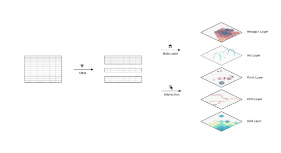
In fact, it is a flexible map visualization tool that is based on working with layers. These layers are called Data Layers in Kepler.gl, and visualizations can be constructed by stacking Data Layers one on top of another. It is entirely browser-based (no data is sent to remote servers), and users can drag and drop CSV or GeoJSON file into the browser, and make very interesting visualizations by stacking layers, filtering and aggregating the data. Automatic data detection is incorporated into the tool so Kepler.gl can identify columns and insights by just having the data loaded.
The Data Layers
The layers are merely data visualizations that can be built on top of one another to create a single map visualization incorporating different data among different layers. They represent the base building blocks of Kepler’s interactive maps. The Kepler.gl’s interface provides various types of layers. Even though layers can come from the same type, they can differ significantly in the final visualization depending on the data that they carry and on their configuration (Kepler provides flexible data manipulation by layer configuration). This kind of customizable data layer creation offers flexibility in the production of interactive maps and gives the users the freedom to manipulate the visualization itself, besides the data.
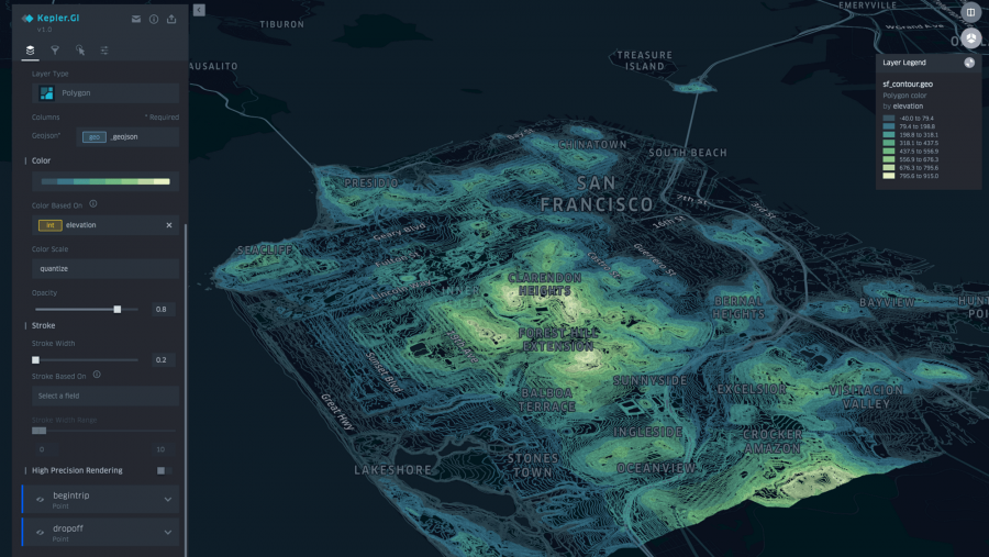
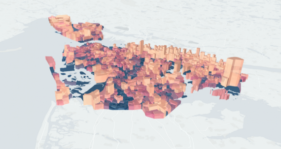
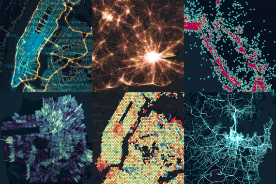
The figure below shows some of the layers. We can see that Kepler is well specialized towards geospatial data analysis and the numerous mapping layers enable to efficiently plot locations of events and places in a perceptually beautiful and understandable way.
As explained in the official Kepler introduction from Uber: “All layer geometry calculations are GPU-accelerated, enabling us to smoothly render millions of points and making Kepler.gl a much more powerful web tool than traditional cartography software.”, the GPU accelerated calculations make Kepler.gl more than an ordinary tool for (geospatial) data visualization.
The Filters
Besides geospatial data, Kepler.gl’s can handle spatiotemporal data and add time playbacks to visualize data evolution over time. This is enabled by the “filters” concept in Kepler.gl. The filters not only provide the temporal visualizations, but they contribute greatly to the flexibility of data manipulation that the tool provides. Filters are based on columns in the datasets, and they can also be used to control the amount of data presented in the maps.
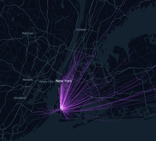
Moreover, Kepler.gl offers a unique geographic filtering function called ‘brushing.’ Brushing allows to highlight and show points or arcs within a certain radius on the map. This simple functionality brings a lot when it comes to geospatial data visualization (where very often origin-destination correlations are needed). The animation below shows one application of this kind of filtering.
Final words
Kepler is a powerful map visualization tool, completely browser-based and optimized for visualization of geospatial data. The data layers and the filters together with low-contrast base maps and the variety of colour blending techniques provide a very flexible tool for creating beautiful maps. Users can build map visualizations that can be exported as static maps or animated videos, in a matter of minutes. Uber has opened its powerful tool to the public and made it accessible to thousands of engineers, data scientists, cartographers and visualization experts. Link to Kepler.gl’s “get started” guide is available here for reference.